Describe Image Line Graph 2- PTE Academic Online Practice Material
Describe Image (Line Graph) – Look at the Line graph and speak into the microphone to explain, what the graph is showing. You have only 40 seconds to describe the image. These type of questions assesses speaking skills.
Describe Image Line Graph 2- PTE Academic Online Practice Material
PTE PRACTICE – DESCRIBE IMAGE (LINE GRAPH)
- Describe the given below bar graph #3
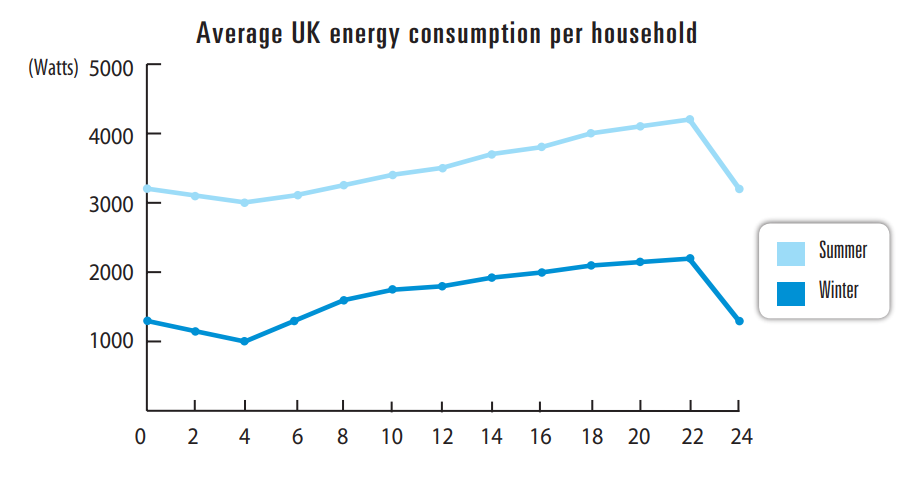
These two graphs show the information about the average energy consumption in the UK throughout the entire day in households during the winter and summer. In the summer, energy consumption is about 3200 Watts at midnight and in the winter, it is about 1300 Watts. Over next four hours, it falls about 200 Watts and 300 Watts, then rises to a high point of 4200 Watts and 2000 Watts at about 10 P.M. Then there is dramatic fall in energy consumption to 3200 Watts and 1000 Watts in the summer and winter simultaneously. In the summer, consumption is roughly 2000 Watts higher, fluctuating between about 3000 and 4000 Watts. Overall, we can see that in summer energy consumption is far higher than in the winter.
- Describe the given below bar graph #4
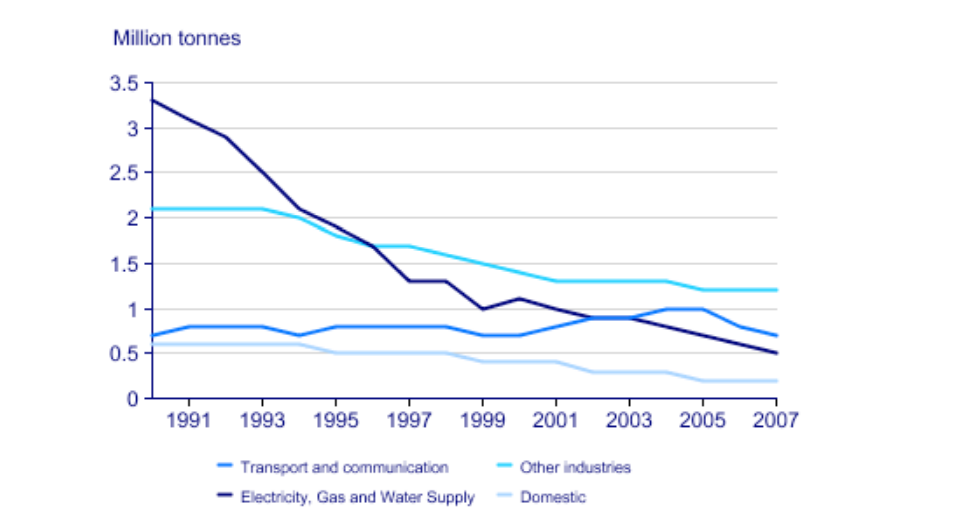
The line chart shows the comparison of four sectors in terms of a number of acid rain emissions that they produced in the UK between 1990 to 2007. It is clear from the graph that there is dramatic fall in a number of acid rain emissions over a period of 17 years. Major decrease was seen in the electricity, gas and water supply sector as it was around 3.3 million tonnes of acid rain emissions in 1990 and figures fell to only 0.5 million tonnes in 2007. The transport and communication sector produced about 0.7 million tonnes of emissions, while a slight increase was seen from 2001 to 2005. The domestic sector terms about 0.6 million tonnes and just over 2 million tonnes of acid rain gases came from other industries.


