PTE Academic Speaking Practice: Describe Image – Line Graph Diagram
Describe Image (Line Graph) – Look at the Line graph and speak into the microphone to explain, what the graph is showing. You have only 40 seconds to describe the image. These type of questions assesses speaking skills.
PTE Academic Speaking Practice: Describe Image – Line Graph Diagram
PTE PRACTICE – DESCRIBE IMAGE (LINE GRAPH)
- Describe the given below bar graph #1
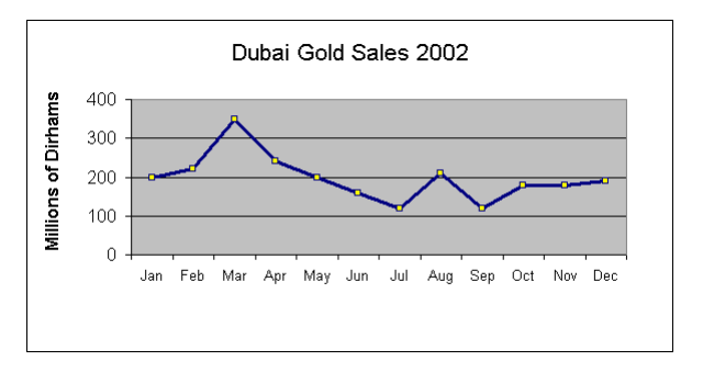
The Line chart shows the Gold sales at Dubai in the year 2002, month wise report was seen. In January, gold sales were about 200 million dirhams per month. In February month, it increased slightly to Dhs 220 million, rising sharply to a peak of 350 million dirhams in March. Over the period of next four months (April, May, June and July), sales started declined steadily and reach the lowest point of 120 million dirhams in July.
In the month of August, there was a sudden increase, where sales almost doubled, rising from Dhs 120 million to Dhs 210 million. Like earlier declined four months, September sales drop to Dhs 120 million from Dhs 210 million, reaching the same level of July month.
From September to October, sales increases from Dhs 120 million to Dhs 180 million. Sales remained steady in October and November. A small increase in December from Dhs 180 million to 190 million dirhams is seen.
- Describe the given below bar graph #2
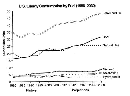
The line graph shows fuel type – energy consumption from 1980-2008, along with the projected use until 2030 in the United States. Fossil fuels are seen the dominant type and will continue to stay in this trend in future also. A small but significant proportion of nuclear and renewable sources out of total energy will also be projected to continue doing so.
Petrol and Oil have the biggest share with 35 quadrillion units (35q) in 1980, rising to approximately 40q in 2008 and this trend is set to continue with a projected value of nearly 50q in 2030.
During 90’s coal and natural gas came in second and third, with around 20q and 16q respectively. There was small up and down during 1980 and 1990. It is seen that coal overtook natural gas after 2015 and is expected to rise in future also. It is estimated that natural gas will level off and remain relatively constant at about 25q at 2030.
The nuclear energy represented around 4q in 1980 and small upward fluctuation is seen during 2005 and is speculated that nuclear energy will reach 10q by 2030. Solar and hydropower was around 5q at 1980, dropping and then remaining constant at approximately 2q.
Don’t forget to write your own answer in the comment box.


