PTE Academic Speaking Describe Image With Answers-Pie Chart Practice
Describe Image (Pie Chart) – You will be given a pie chart. To study the pie chart, you have only 25 seconds. Then describe the chart in your own words in 40 seconds. These type of questions assesses speaking skills. PTE Academic Speaking Describe Image With Answers-Pie Chart Practice.
MODEL ANSWER FOR DESCRIBE IMAGE (PIE CHART)
PTE Academic Speaking Describe Image With Answers-Pie Chart Practice
1. Look at the pie chart and describe it in 40 seconds.
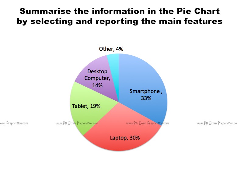
The diagram shows the result of a survey in which people aged 16 and above were asked to give their preferences of devices for browsing the internet. The pie chart illustrates which device out of the smartphone, laptop, tablet and desktop computer preferred by the internet users to access the internet. The third portion of total participants goes out with smartphones. Maximum of all participants prefer to use laptops and smartphones by just 3% difference between the two. A desktop computer and tablet accounts for 14% and 19% respectively of user’s preferred devices. Only a small portion of 4% people prefer a device other than these four main devices.
Related PTE Questions –
2. Look at the pie chart and describe it in 40 seconds.

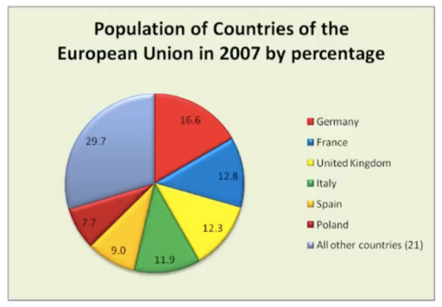
This pie-chart represents the population of the countries in the European Union during the year 2007 by percentage. Germany tops the list with 16.6 percent of the population followed by France at 12.8 percent. The United Kingdom and Italy are at the 3rd and 4th places with the population under 13%. Spain and Polland top the lower population in the European Union. In conclusion, Germany was the most populated while Polland was the least populated and there were 21 other countries that form about 30% of the population but not specified in the chart.
3. Look at the pie chart and describe it in 40 seconds.

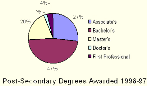
The pie chart shows the information about post-secondary degrees awarded in 1996-97. The highest degrees awarded for the profession of Bachelor’s that was 47% followed by the percentage of degrees for Associate’s that was 27% whereas the least percentage of degrees awarded for the profession of first professional and Doctor’s that has remained below 5%. To conclude, most of the students were bachelors where doctors were low.
PTE Academic Describe Image Collection With Answers
To stay updated, like us on Facebook.

